
Norwegian BioArt Arena
Visual identity and illustration for art 
Sketches for a poster and brochure for Norwegian BioArt Arena (NOBA). The image in the middle is from the visual artist Marta de Menezes – In the beginning there was the Word (↪︎ source here). The image on the right is from the artist Hege Tapio – Human oil, a live performance with NOBA (↪︎ source here).
Norwegian BioArt Arena combines art, research-based knowledge, critical thinking and new technology with the aim of stimulating increased awareness of our living environment, biology, and sustainability. NOBA is the first permanent arena for BioArt in Norway. BioArt combines science and art with a focus on sustainable development, the environment, and life sciences.
I had the privilege of designing NOBA's visual identity and applying it to various platforms, such as social media, posters, and flyers. I also created subidentities for NOBA's symposiums and art exhibitions.
Visual identity
The visual identity I created for NOBA is inspired by the idea of change and transformation. These are both characteristics of BioArt works, often using living material, organisms, and natural processes.
It has an organic feel and reflects the deep connection between art and nature. The visual identity shows the interaction, the intertwining between scientific and artistic communities.

Sketches of posters with and without photos

Sketches of posters

Sketches of the homepage and social media

Sketches of tote bags

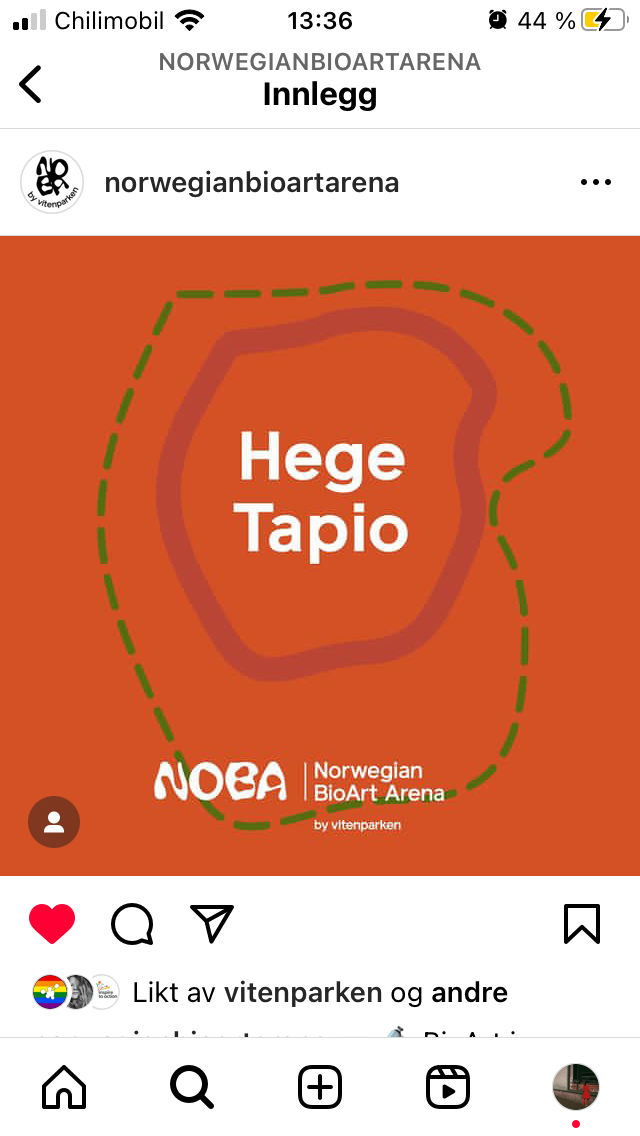
Social Media implementation promoting bio-artists

Food Phreaks!
An exhibition at NOBA

Posts and banners for SoMe promoting Food Phreaks!

Poster and exhibition view.

Exhibition view. Photographs by ↪︎Joe Urrutia
I carried out my work for NOBA while employed at Vitenparken Campus Ås. I collaborated with Annike Flo (project leader) when designing the visual identity of NOBA. For the exhibition Food Phreaks!, I collaborated, amongst others, with artists from the Center for Genomic Gastronomy and Elina Gobeti, marketing consultant at Vitenparken Campus Ås.
Learn more about NOBA ↪︎ noba.art