
UX / UI DesignVisual & Sound art history app

Project overview
The product
A visual and sound art history app – as a source of inspiration to develop artistic works, a form for recreation and to learn something new (curiosity).
Project duration
September 2023 – February 2024
The problem
Making sound and visual art easily accessible, for those interested in learning more about art and culture, including people with visual impairment, time constraints, and in isolated areas where art is scarce.
The goal
Creating a easy to use tool that showcases both visual and sound art, that inspires art enthusiast and professionals.
My role
I have worked in this project from beginning to end.
Responsibilities
Conducting user research, user testing, wireframing, prototyping.
Understanding the user
User research / Personas / Problem statements / User journey maps
User research: summary
We conducted interviews and created empathy maps to understand the users we are designing for and their needs. A primary user group identified through research was people who have english as second language, aren’t necessary art educated but are interested in art and history.
The user group confirmed initial assumptions for the Art History App, but it also reveal that sound art is not always available and that would be appreciated by users with visual impairment.
User research: pain points
Time
Busy lifestyle gives little time to develop hobbies
Language
English as a second or third language creates some language barriers at time
Visual impairment
Visual impairment makes it difficult to appreciate some visual art works
Persona: Leonard Sequoia

Problem statement:
Leonard Sequoia is a 20-year old immigrant with a visual impairment who needs sound art to be more easily accessible because he is interested in learning more about art and culture without language and sight barriers.
User journey map
Mapping Leonard's user journey revealed how helpful it would be for users to have access to a dedicated Art Library app.

Starting the design
Paper wireframes / Digital wireframes / Low-fidelity prototype / Usability studies
Paper wireframes
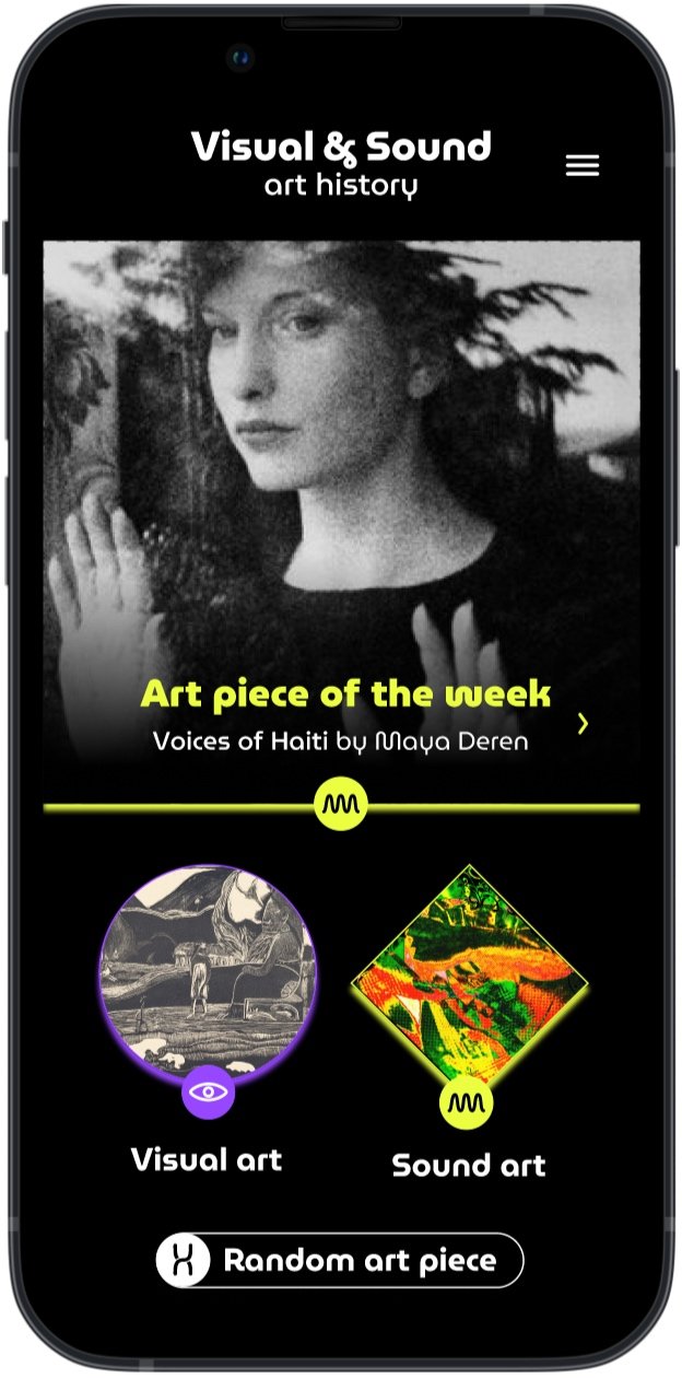
Taking the time to draft iterations of each screen of the app on paper ensured that the elements that made it to digital wireframes would be well-suited to address user pain points. For the home screen, we prioritised a quick access to sound art and visual art categories, and a feature random art piece to help users save time and feed curious minds.
Stars were used to mark the elements of each sketch that would be used in the initial digital wireframes.
Digital wireframes
As the initial design phase continued, we made sure to base screen designs on feedback and findings from the user research.

The home screen provides easy access to an art piece randomly, and easy access to sound art, in addition to visual art.

Easy access to navigation that is screen reader friendly.
Low-fidelity prototype

Usability study: findings
We have conducted two rounds of unmoderated usability studies, including a System Usability Scale to find out if users find the app easy to use and if there are more features that users would like to see included. Findings from the first study helped guide the designs from wireframe to mockups. The second study used a high-fidelity prototype and revealed aspects of the mockups needed refining.
Round 1 findings
Users need appealing images
Users find the prototype intuitive
Users want to relate the visual art to the sound art together
Round 2 findings
Users need a clear home button
Users find the prototype clear and straightforward
Users liked the prototype and find it visually appealing
Refining the design
Mockups / High-fidelity prototype / Accessibility
Mock-ups
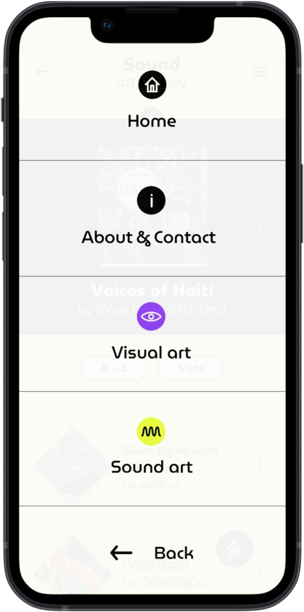
The second usability study revealed frustration finding a way back to the home screen. To streamline this flow, I added a home button visible at all times on the bottom right corner of the screens, and a home button on the top of the menu screen.
Before usability study

After usability study


Hig-fidelity prototype
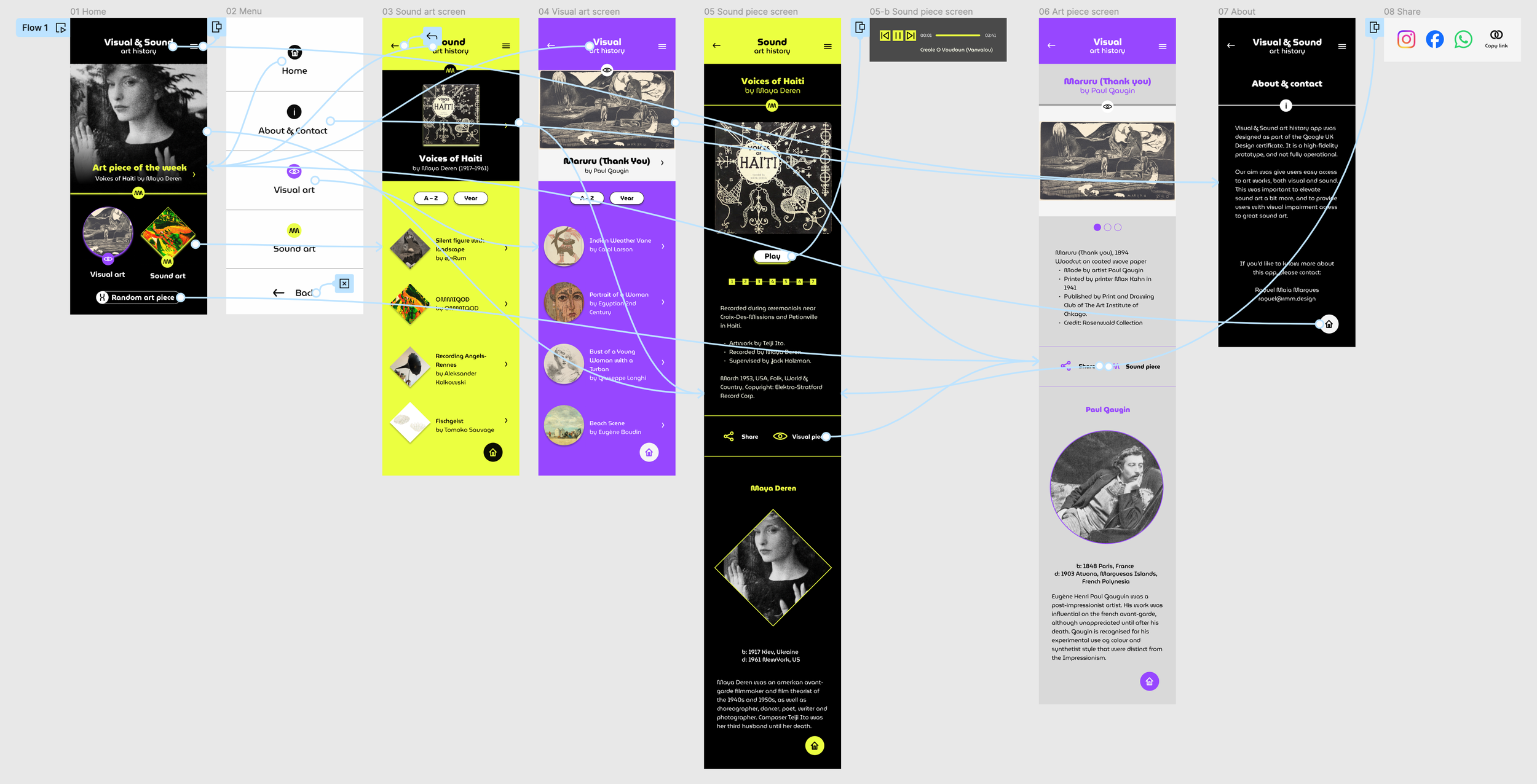
Accessibility considerations
Use of distinctive colours, associated with specific shapes and symbols, helping differentiating the visual art from the sound art dedicated screens and areas on the app.
Use of good color contrast between background, text and imagery.
Use of imagery in a big scale. Together with large text size, and a font with good legibility.
Going forward
Take aways / Next steps
Take aways
Impact:
“Very nice visuals, design of the app”
"I like the fact that the pictures are big, so it's very appealing and nice"
"I like the colors, I think it's pretty, tasteful"
"I think it's very clear, easy to navigate"
"I like the small details, like the menu button that changes when I put the cursor on it, or the logos on the menu, this is playful as well"
"I like everything about it"
What I learned
I have learned the whole process of User Experience Design. Starting with understanding and empathizing with users, defining their pain points, coming up with ideas for design solutions, and analyzing and synthesizing my research. I have created paper and digital wireframes, low and high fidelity prototypes and tested my designs with real users to get feedback.
Next steps
Create a search function in the catalogue as it grows.
Create themes within the catalogue, connected with actual events, linking the past and present together.
Invite artists to curate the art piece of the week feature, linking the art community to the Visual & Sound art history app users.